Many people assume when they create files for print, or check a proof from their designer, that the colours they see on screen will print pretty much as they see them on screen.
Wrong!
It’s frustrating. There’s so much technical jargon around printing, and setting up files incorrectly can risk a result that’s a long way from what you expected.
Whether you’re creating your own artwork to send to your print supplier, or getting help from a graphic designer, it’s important to understand how to set up your print files correctly for colour.
CMYK, RGB, PMS – What does it all mean?
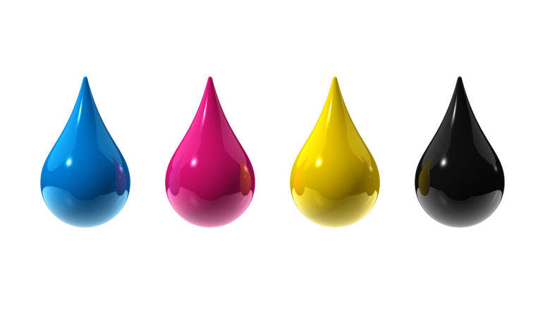
CMYK
Cyan, Magenta, Yellow, Black, often called full colour or four colour process printing. Most newspapers, magazines, books and printed marketing materials use this colour process. C,M, Y and K combine as a dot pattern to create most visible colours. If you look at a magazine image under a magnifying glass, you’ll see how it works.
CMYK colour is used on both digital and offset presses, and is now the dominant method for colour printing.
RGB
Used for on-screen images, and consists of only 3 colours – Red, Green and Blue. It is the colour model used for computer monitors, tablets and smartphones. These screens add light to a black background to create colour, so produce a very different result to printing ink or toner on white paper. RGB is not used for production printing.
PMS (Pantone Matching System)
A structured and very accurate colour matching system, also know as Spot Colour printing. Ink colours are blended to a numbered formula to provide a consistent match to the colour samples in the Pantone swatch. PMS inks are used in offset printing.
Close match to PMS
It is possible to get a fairly close match to a PMS colour when using the CMYK process, and for many businesses, the cost advantages of this make it a more attractive option.
Choosing your print colour system
When deciding whether to print in CMYK or Pantone colour, consider
– The processes offered by your supplier
– Degree of colour accuracy required
– Price
– Lead time
– Quantity
Ask your print supplier about this before your or your designer start creating files. That way you’ll be on the right track from the beginning. The range of colours available in each colour system is not exactly the same, so good advice could be important.
Want more information on setting up files for your next print job?
Call Viv Kane on (03) 9510 4700 or email [email protected]
This article originally appeared in HerBusiness.com.au